The Application of Color in Medical Product Design
In medical settings, the color of a product is not merely an aesthetic element but a critical link connecting patient psychology, healthcare professionals' operational efficiency, and medical safety. From diagnostic equipment in outpatient clinics to nursing instruments in wards, and further to life-support equipment in emergency scenarios, the rational application of color can significantly alleviate patient anxiety, reduce operational errors by medical staff, and enhance the quality of healthcare services. With the growing emphasis on human-centered design in healthcare, the strategic value of color in medical product design has become increasingly prominent. It is essential to establish a systematic application framework from three dimensions: functionality, science, and practice.
Outline for This Issue:
· The Functional Value of Color in Medical Products
· Scientific Methods for Selecting Colors in Medical Products
· Professional Application of Color in Medical Product Practice
(The Functional Value of Color in Medical Products)
When designing and developing medical products, color is often overlooked. However, for Gravity Design, it plays a significant role in establishing brand identity, improving device usability, and eliciting positive emotional responses from both patients and healthcare professionals.
· Cleanliness
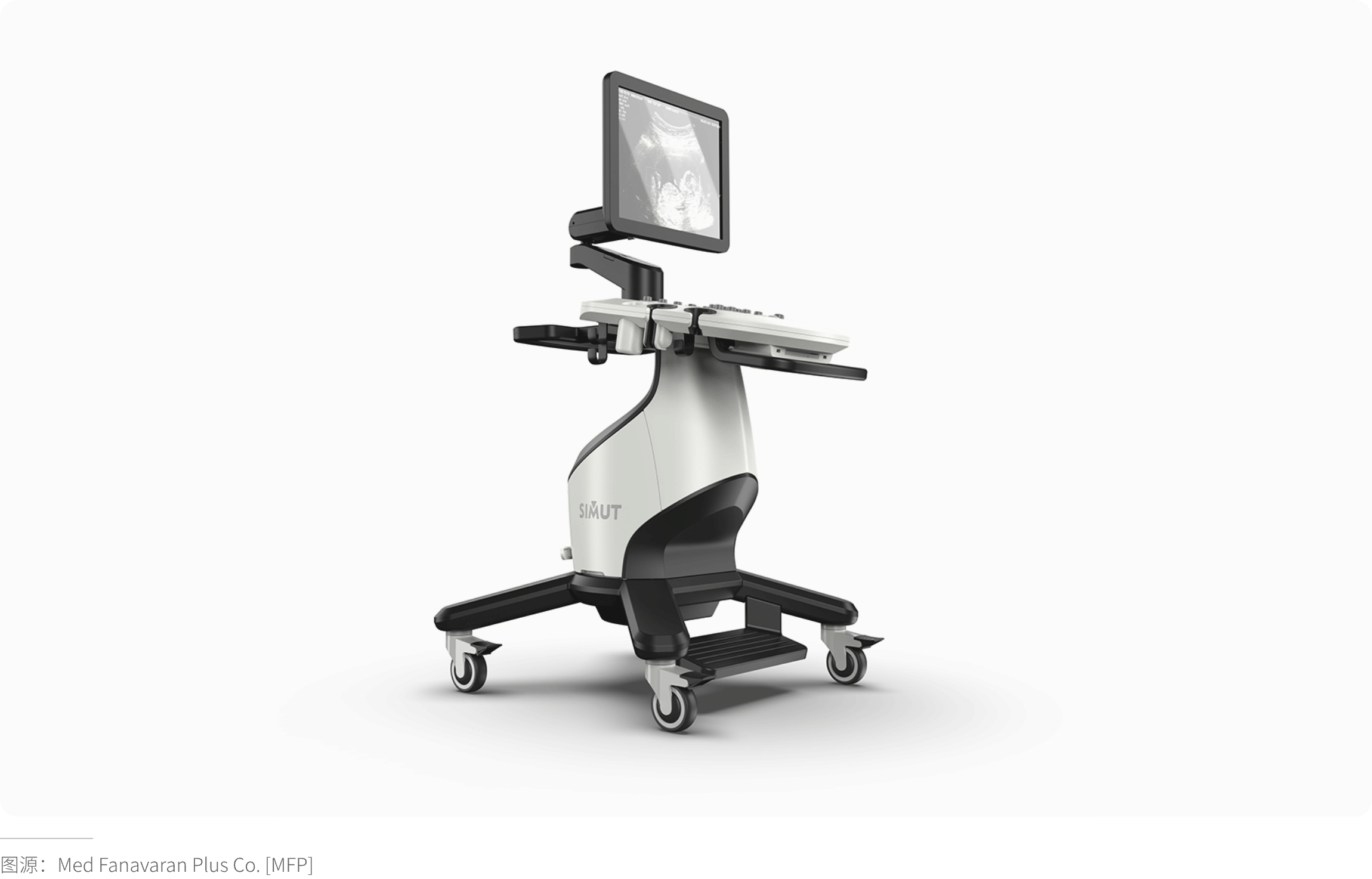
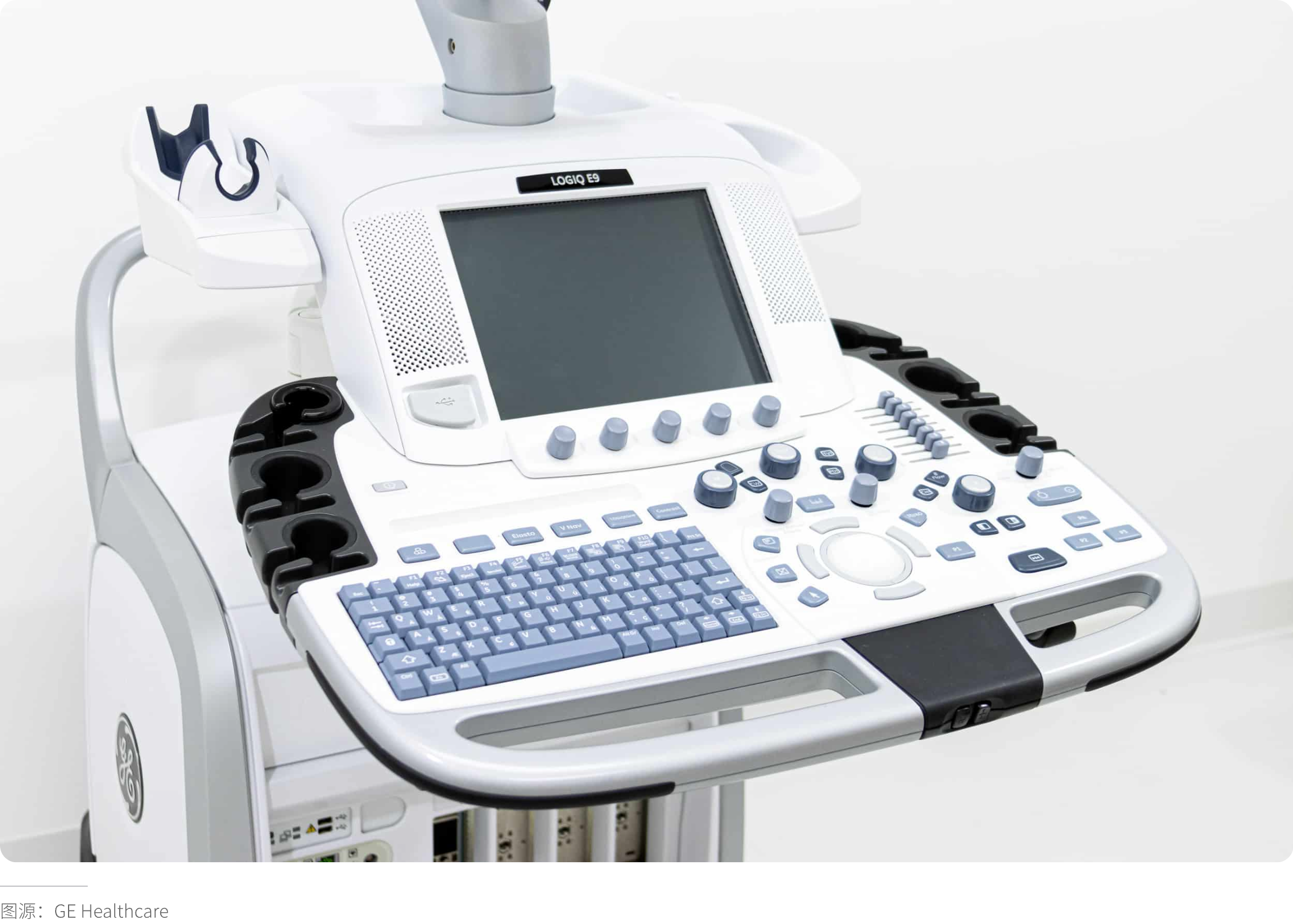
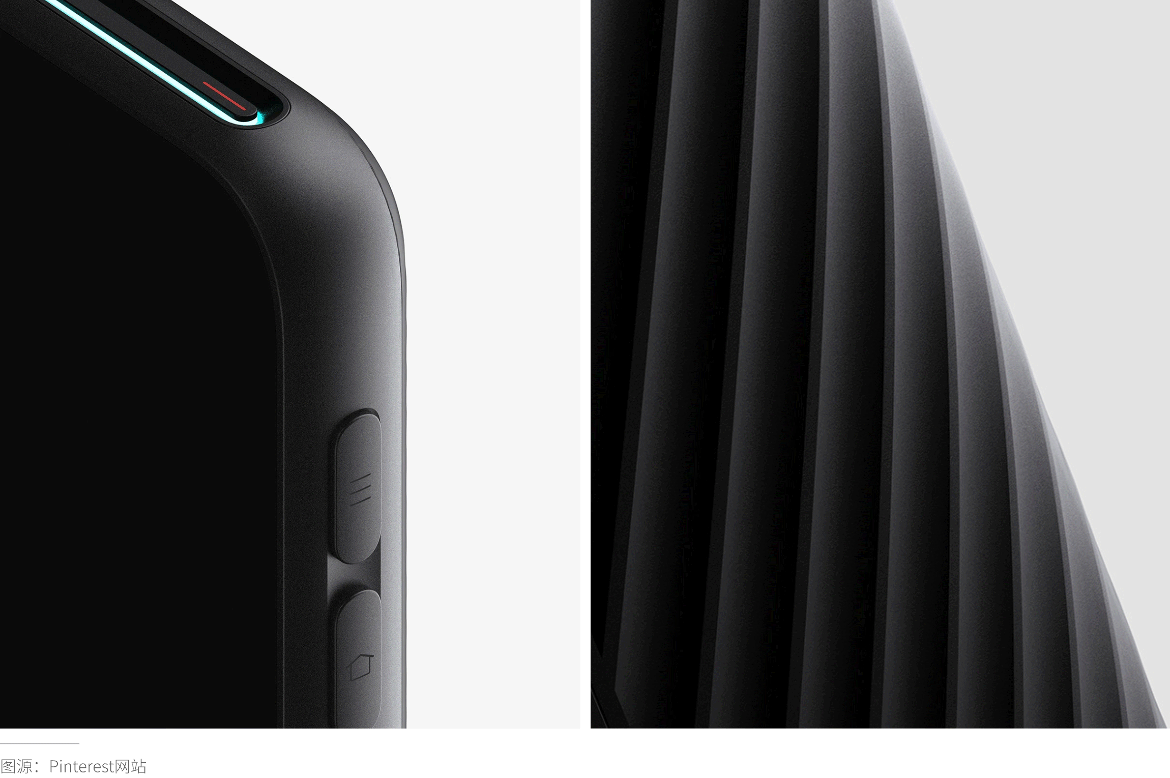
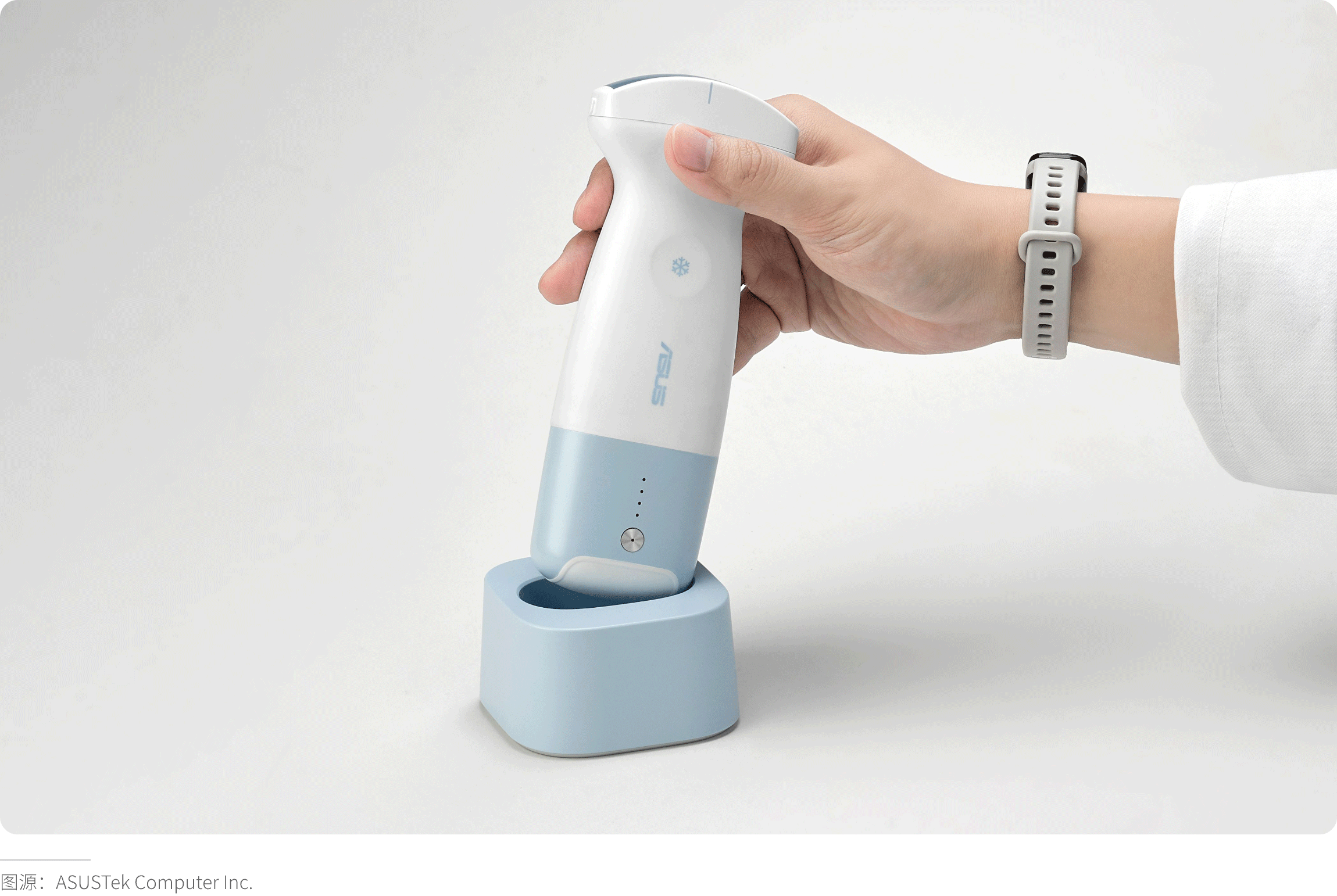
The use of white, light gray, or light neutral colors in medical product design creates a color impact for functional reasons: dirt and stains stand out against light backgrounds. This color contrast makes it easier to determine whether a device has been thoroughly cleaned, thereby encouraging staff to maintain cleanliness. On the other hand, dark colors can conceal dirt, which is why most casters are dark. For the same reason, the bases of floor-standing products, control panels, handles of medical carts, and any other areas prone to frequent soiling are often designed in dark colors. In ultrasound devices, probe holders are typically dark-toned—this color not only influences the design of medical products (helping users quickly locate the holder after using the probe through color contrast) but also conceals scratches and signs of wear.
· Visual Flow (Direction)
Color guides the eye through layers of information, which is particularly useful for devices requiring multi-step operations. In the hierarchy of our visual system, contrast is the first element to capture attention—initially through value contrast (dark vs. light), followed by hue contrast. By using color to highlight areas of a device that require user interaction, a cognitive map is created, allowing users to intuitively understand how to power on the device, where to push, pull, or lift to access ports, where to connect Luer connectors, or simply identify the most critical operational controls.
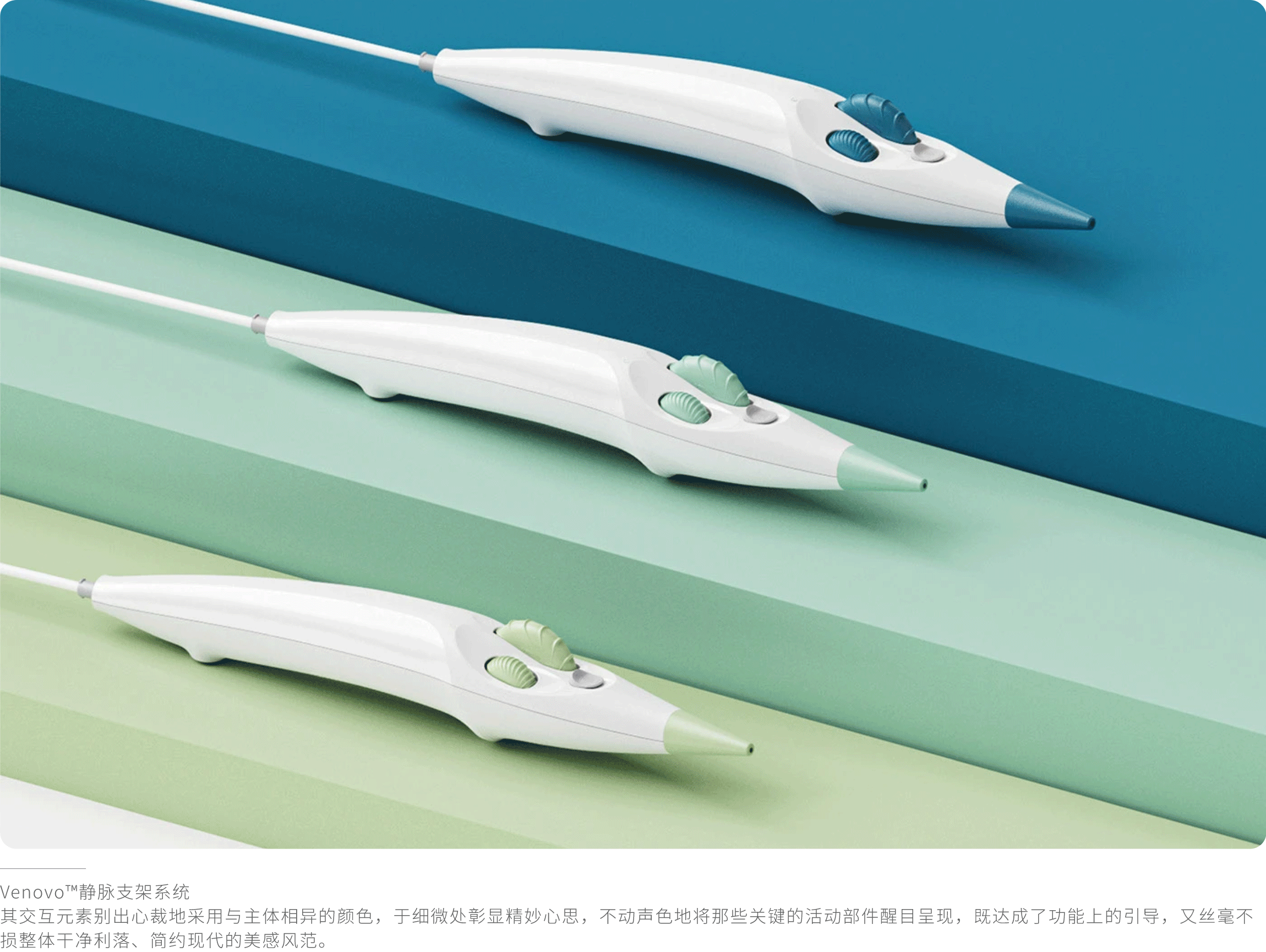
· Color Coding
Beyond capturing our attention, color is highly effective in providing organizational systems. It can classify or group related functions, creating a structure that defines distinct functional zones and levels of importance. This approach represents a subtle yet powerful technique.
For instance, the interactive components of this GE Healthcare ultrasound system are meticulously organized through layout and the use of varying shades of blue-gray. The colored buttons and knobs designed for user interaction immediately stand out against the white background due to their high contrast. The metallic gray trackball, distinguished by its unique color, signals a distinct function to users. Light gray buttons surround and support the trackball’s functionality. These are encircled by a set of light blue buttons, which, in turn, are framed by a group of dark blue buttons and knobs, creating a visual hierarchy in the medical device design. The variation in blue shades divides the buttons and knobs into two groups, indicating that those in the dark blue set are used more frequently or are of higher importance. The keyboard is also subtly tied together through color coordination. This design has been shown to improve operational efficiency by 40%.
· Influencing Emotional Responses of Patients/Users
Colors ranging from yellow-green to purple are considered cool tones. Cool colors are perceived as more passive than warm colors and are associated with cooler temperatures and a sense of relaxation. Due to their calming qualities, they are widely favored in hospital environments and have a significant impact on the appearance design of medical products. Colors from yellow to red-purple are warm tones. Warm colors are vibrant and cheerful, making them particularly suitable for rehabilitation purposes. In addition to being energetic and joyful, yellow also carries a youthful quality, which is why it is extensively used in pediatric medical devices. Warm colors are also well-suited for instruments that feel cold to the touch, as they can psychologically alleviate the sensation of coldness.
High-saturation tones appear bold, while low-saturation tones tend to feel softer. Muted colors, with their lower saturation, are widely used in hospital environments to help alleviate patient stress. High-saturation colors can be energizing or alerting. When applied against light backgrounds, they are highly effective in capturing user attention and are often employed as warning indicators.
Differences in lightness also create contrast, serving as another method to draw attention. Additionally, dark colors (low lightness) tend to appear heavier, conveying a sense of security and stability. When used at the base of a machine or device, they suggest sturdiness and solidity, while also implying a serious character. Light colors (high lightness) symbolize cleanliness and purity. Their perceived lightness makes them a popular choice for large medical equipment, as they help avoid an overwhelming visual presence.
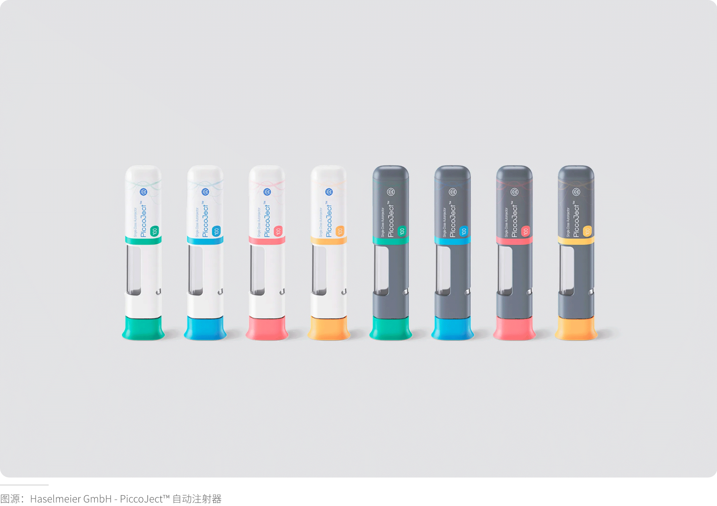
· Product Family Identification – Color as a Brand Differentiator
Logos are excellent for building brand recognition. However, from a distance, logos can become difficult to distinguish. Color, on the other hand, remains clearly recognizable whether viewed up close or from afar. Consumer product companies have long recognized the potential of color in enhancing brand recognition and are successfully leveraging it. For medical device companies, color is also one of the most powerful tools for creating a design language across a product family, enabling immediate identification of devices from your company. Emphasizing this aspect helps build trust: if your products are reliable, your brand is perceived as trustworthy, and vice versa.
(Scientific Methods for Selecting Colors for Medical Products)
Color selection is an ever-evolving process, as people's responses to colors can vary across different eras and cultures. Colors and their combinations also acquire specific connotations based on how they are used in the commercial sector (such as in branding) and their prevalence in relevant contexts. The popularity of colors and palettes tends to follow cyclical trends. While medical products are less susceptible to fashion and trends, color trends do influence the appearance design of medical devices: using trendy colors can make a product look more modern and contemporary, rather than outdated. The psychological impact of using the "newest and best" colors should not be underestimated.
· Understanding the User
When considering color, it is essential to understand who the product users are and, from a color perspective, what appeals to them. "Appeal" here does not merely refer to their color preferences but rather which colors they associate with specific characteristics and values. Do users expect the product to convey precision, intelligence, durability, sophistication, or other qualities? Are there specific colors or color combinations that can be linked to these attributes?
· Understanding the Context
The design of medical products should be grounded in an understanding of the context in which the product will be used. This encompasses everything from the physical environment where the product is used/stored/transported to the ethnic and cultural context of the product's location of use. To comprehend and select appropriate colors, the following factors should be considered:
1. Existing (Competing) Products. What are other companies doing in the same product category? Are their colors bold or understated? Should the product align with competitors or stand out with distinct differentiation? Are there specific colors that are expected in this product type?
2. Usage Environment. In what environments will your product be used? Are there specific dominant colors in these environments? Is the environment visually noisy, calm, or somewhere in between? Will the product be used primarily in hospitals/clinics, homes, or public spaces? How should the product present itself in its environment—should it be noticeable or blend in? Does it need to be discreet, or can it serve as a status symbol?
3. Cultural Considerations. What do different colors symbolize in different cultures? How strong are these symbolic meanings? Can these symbolism be overlooked to use colors that better serve other design objectives?
4. Corporate Colors. Color selection for medical product design should be strategic, fully considering the functional and psychological properties of color. Corporate brand colors might be appropriate, or they might not. It's important to remember all other factors influencing color choice and preferably not be limited solely by corporate palette.
5. Sterilization Methods. If your product is reusable, the impact of the sterilization method on the product's color must be considered. Ethylene oxide sterilization and gas plasma sterilization have minimal impact on color. Radiation sterilization using gamma rays or electron beams can cause yellowing of colors.
· Understanding the Usage Environment
Medical products are used in diverse environments, including hospital wards, operating rooms, clinics, and homes. Different environments impose different requirements on product color, necessitating careful consideration and appropriate color matching during design.
In hospital wards, where the overall environment is typically dominated by soft tones like white and beige, medical product colors should harmonize accordingly. Avoid overly bright or glaring colors to create a warm, comfortable atmosphere conducive to patient rest and recovery. For instance, bedside call buttons in wards might use light gray or pale blue—unobtrusive yet easily identifiable and usable by patients.
The operating room is an environment demanding extreme concentration. Medical equipment colors should be simple and subdued to avoid distracting medical staff. Low-saturation colors like black or dark gray can contrast with the white walls and instruments of an OR without being overly conspicuous, helping maintain a serious and professional atmosphere.
For home-use medical products, like home glucose meters or thermometers, color choices can be more diverse and personalized. Softer, more approachable colors like pink or light blue can make the product appear warmer and friendlier, reducing patient resistance to using medical devices at home.
Ambient Light Influence: For products designed for use in operating rooms and other high-illumination environments, note that white reflects the most light, potentially causing glare and eye strain. Giving white surfaces a matte finish can help mitigate these issues to some extent.
(Professional Application of Color in Medical Product Practice)
· Surface Finish
Surface finish significantly impacts how a color is perceived. Using a single color effectively can involve applying a matte finish to some components and a glossy finish to others. It's also possible to use three or four different texture levels with a single hue to create a value composition. The way light reflects differently off various surfaces causes variations in perceived lightness, making the eye perceive different colors.
Surface finish is inextricably linked to how color is perceived. The same color can look significantly different depending on the surface material (e.g., metal, brushed finish, anodized, transparent, translucent).
For medical products, surface finish affects cleaning and disinfection efficacy. High-gloss mirror finishes easily show fingerprints and stains, while overly rough textures can harbor contaminants.
· Scale and Size of Medical Products
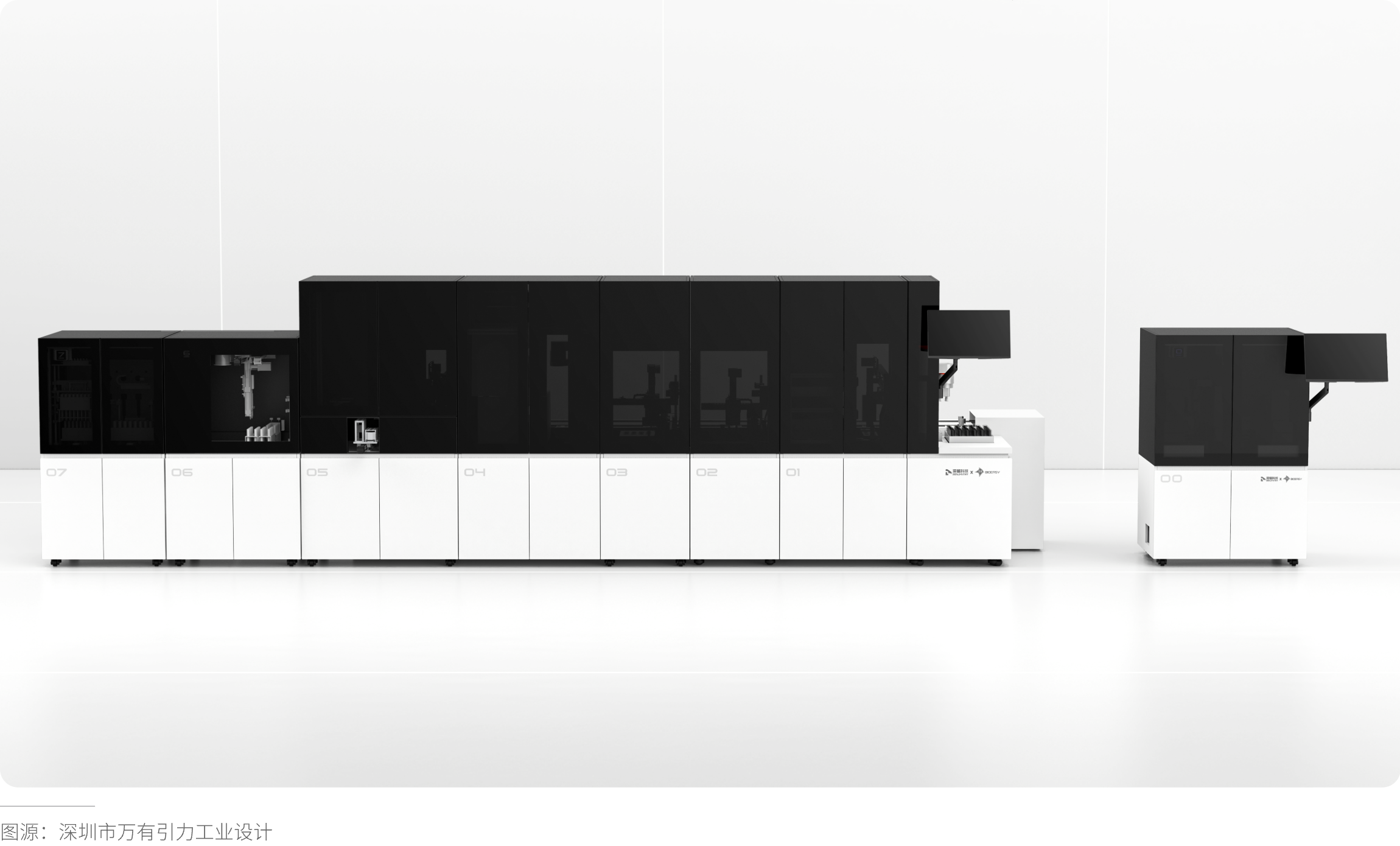
The selection of color varies with the scale of the medical product. Large-scale products often require more extensive use of neutral colors to avoid overwhelming the space they occupy. In contrast, smaller products, such as handheld tools and devices, can more readily incorporate darker, bolder, and more saturated colors in their overall design.
Color selection for large products is more complex, as most physical color chips are relatively small compared to the product's actual size. The same color can appear noticeably different when applied to a large surface versus a small one. To accurately evaluate a color for a large medical product, it is advisable to mix candidate colors as paint and apply them to wooden boards measuring at least 15 x 20 inches (approximately 38.1 x 50.8 cm) or larger. These boards should then be compared and assessed within the actual environment and under the typical lighting conditions where the product will be used. This method provides a much clearer understanding of how the color will ultimately appear on the product compared to relying solely on a 1-inch color chip. The perception of color is highly dependent on the context in which it is viewed, which is why evaluating color within an appropriate environment is essential.
· Emotional Content of Color
Our decisions are largely driven by emotion, even though most people might believe they rely primarily on rationality. However, the largely unconscious physiological and psychological processes within us have a tremendous influence on how we think and the conclusions our conscious minds reach. Among the things that elicit emotional responses from us, color ranks near the top.
When considering the emotional impact of color, it is crucial to have a clear understanding of the overall effect you want the design to achieve. Should it calm the patient? Should it make the surgeon appear intelligent and precise? Should it be playful to appear less threatening to children in a pediatric setting?
Much of our emotional response to color stems from the symbolic meanings associated with certain colors. Complicating matters, color symbolism can vary across cultures, and the emotional impact of color can differ from person to person. Despite these limitations, certain colors do seem to elicit more or less common reactions. You can make informed color choices by considering the following:
White strongly symbolizes cleanliness/sterility and purity, making it highly suitable for medical environments. Because any color contrasts with white, using a neutral white for the main body of a form allows you to easily use color to delineate and draw attention to input areas, thereby enhancing the device's usability.
Light gray does not carry the same connotation of purity as white. However, given the ubiquity of white in medical environments, light gray can serve as an excellent alternative to differentiate a product. While bright white may appear overly stark and rigid, light gray offers a softer and calmer aesthetic.
Blue has a soothing effect. It is widely regarded as one of the most tranquil and calming hues, which explains its dominant presence in medical product design. Green also possesses calming properties and is associated with balance, harmony, and reassurance. Using soft shades of green or blue for key areas of medical devices can reduce their perceived threat—making them particularly suitable for clinical settings where patients receive treatment.
Black symbolizes seriousness, sophistication, and mystery. It is highly effective for laboratory equipment. However, since black is often associated with mourning, its use in clinical settings requires careful consideration.
Red is energetic and vibrant. As a primary color, it is well-suited for pediatric environments. However, due to its strong association with blood, red should generally be avoided on clinical equipment unless used minimally and for functional purposes, such as drawing attention to critical areas.
Yellow represents sunshine, optimism, and friendliness, making it highly suitable for pediatric settings. However, excessive use of yellow can be overly intense, so it should be applied judiciously.
Orange is a joyful color and can therefore evoke comfort. Yet, like yellow, too much orange may feel overwhelming.
Brown can convey reliability and support in certain contexts, but its association with decay makes its use in medical equipment questionable.
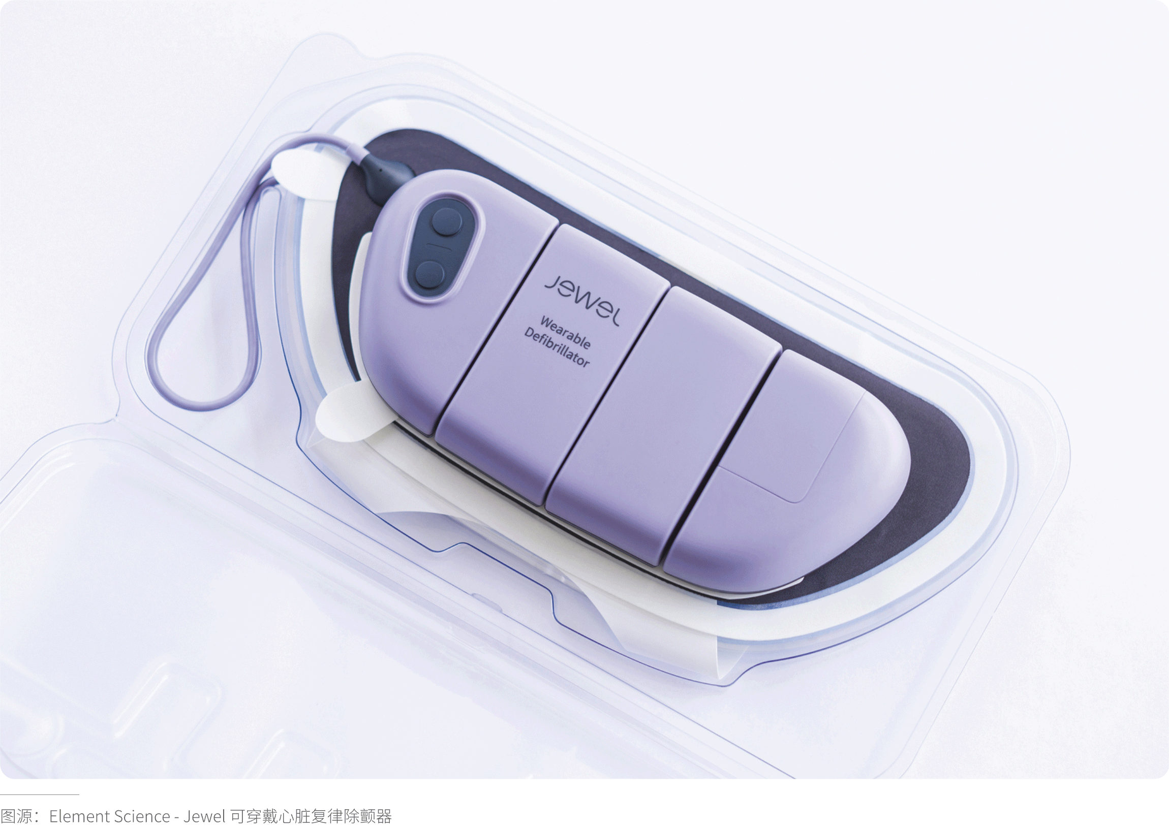
Purple is not only linked to royalty but also deeply connected to spirituality. Thus, it can be used to provide comfort to patients in recovery. Light purple evokes a sense of romance, sophistication, and femininity. We are increasingly seeing purple applied in medical devices, as it is perceived as serious and contemplative—a color that encourages introspection, thereby imparting a calming effect.
(Conclusion)
In medical product design, selecting the appropriate color requires consideration of numerous factors. Understanding the user, the goals the product needs to achieve (not only in terms of functionality but also the overall user experience), and the environment in which the product will be used forms the foundation for making informed color choices. Knowing how to alter the message conveyed by a product through hue, saturation, and lightness, as well as comprehending the emotional and psychological connotations carried by different colors, constitutes the theoretical basis for making thoughtful color decisions.
The topic of color is rich and complex, yet it remains a powerful tool in design. Gravity Design hopes that the information provided in this article will assist you in making deliberate, considerate, and appropriate color choices for the medical products and devices you design in the future.
Stay tuned for more insights, and we'll see you in the next issue!