Product Design Tips — Clever Use of Bright Colors as Accents
"A speck of red amidst a sea of green" is the most visually striking way of communication. In product design, using a small proportion of vibrant color as a local accent achieves the effect of "putting the finishing touch." For example, adding a touch of orange to a white product can break the monotony and make the product more eye-catching. This is a very common approach in product color matching — the bright color accent. On the basis of a clean product form and color scheme, the use of localized bright accents instantly makes the product stand out. Designers, through their understanding of color, can pair accent colors not only to highlight product details and enhance perceived quality but also to convey information and functional cues. This technique is highly popular in design.
Outline for this issue:
· Overview and characteristics of accent colors
· Tips for selecting accent colors
· Methods for distributing accent colors
(Overview of Accent Colors and Their Characteristics)
Accent colors, also known as highlight colors or pop colors, are emphasizing colors in the industrial design color system characterized by small areas and high contrast. Through restrained use of color, they break visual monotony, focus attention on functional areas, enhance product hierarchy and brand personality. While ensuring overall simplicity and unity, they achieve a color effect of "highlighting without overshadowing, emphasizing without cluttering." They are an important design tool for balancing product aesthetics, functional semantics, and brand identity.
In modern product design, details often determine the overall visual experience and emotional resonance. The use of accent colors, as a highly expressive design technique, injects unique personality and vitality into products through clever color matching. Whether it's calm neutral tones or bright, vibrant accents, the proper use of accent colors can effectively guide users' visual focus, enhance product recognition, and improve user experience.
· Core Functions and Roles
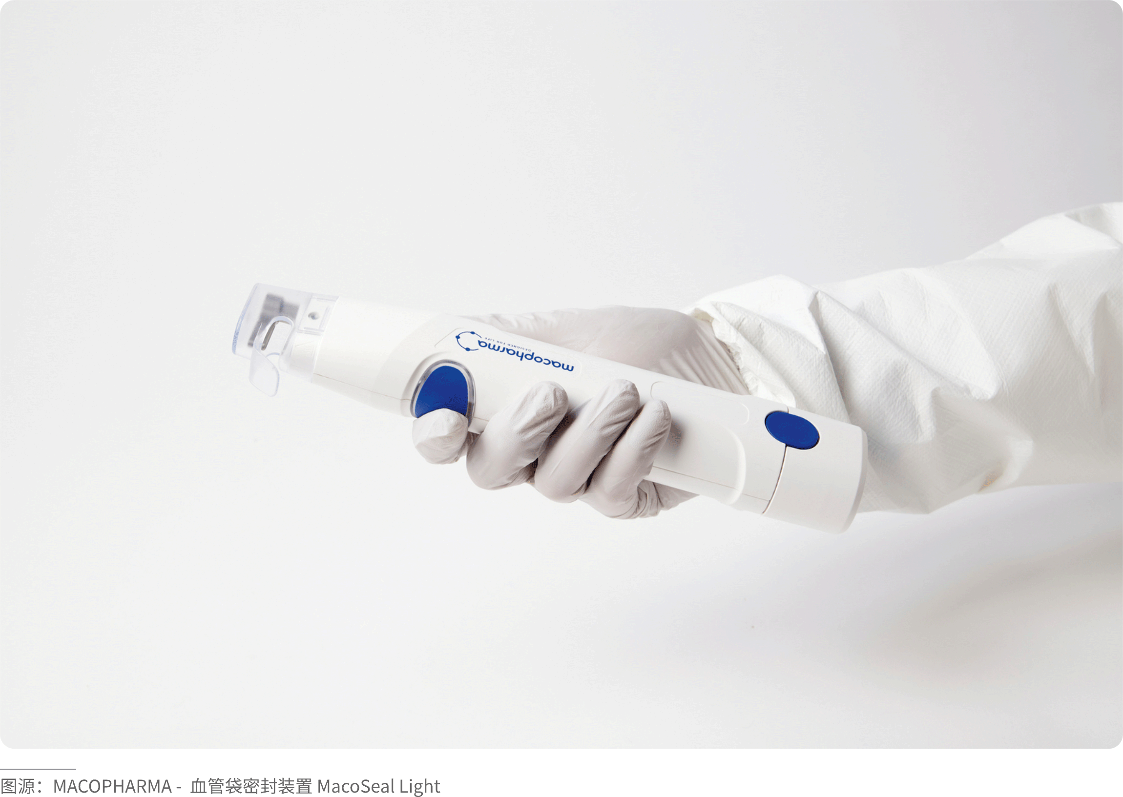
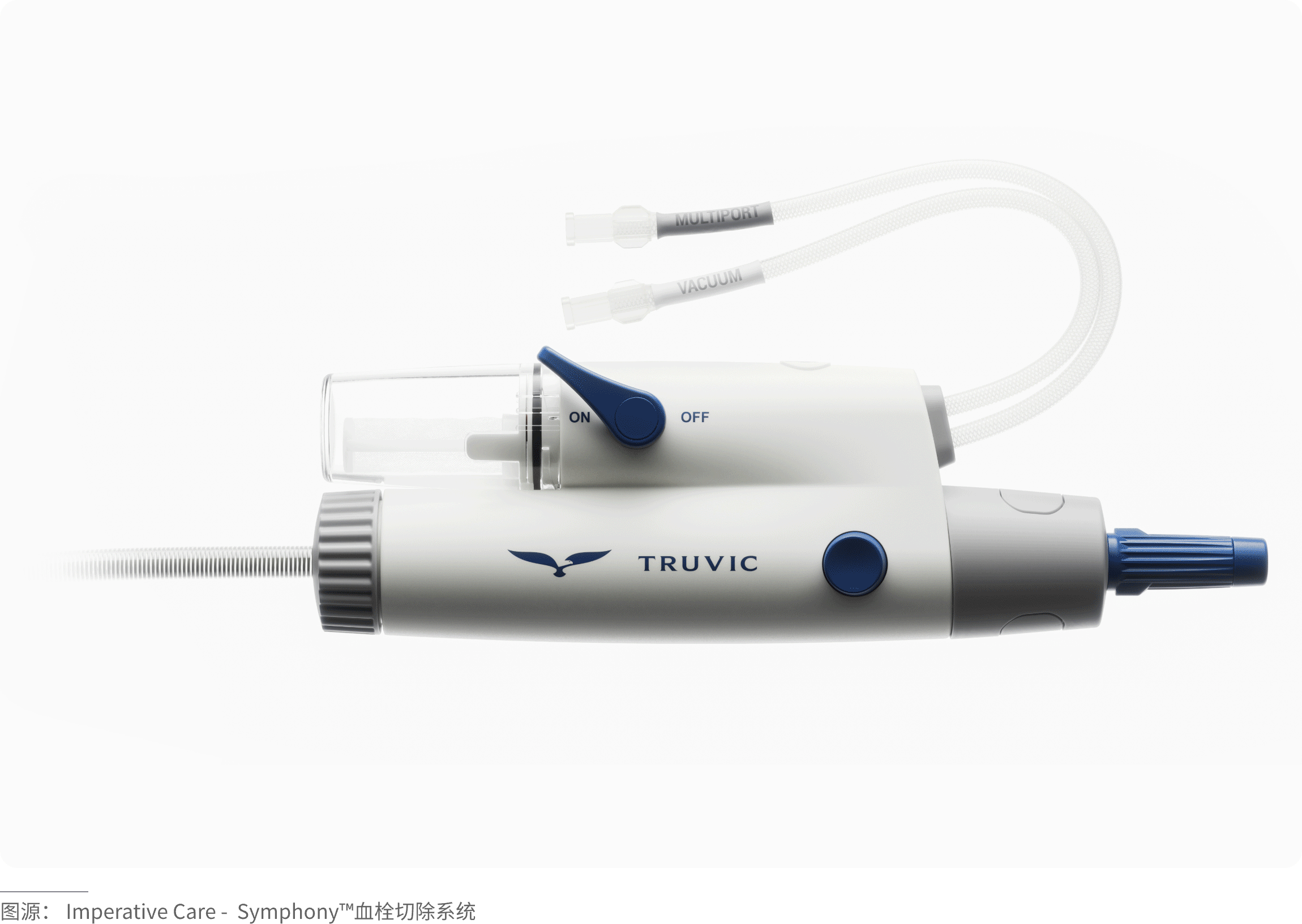
1.Functional highlighting (visual guidance): High-contrast colors are applied to specific user interaction points, such as buttons, levers, handles, or grips, to indicate how to use the product.
2.Safety and warning: Vibrant colors like red, orange, or yellow are used to immediately draw attention to hazardous areas or emergency controls.
3.Brand identity and differentiation: Companies use signature accent colors to build brand recognition. A distinctive color can make the product stand out at a glance and create a unified series identity.
4.CMF (Color, Material, Finish): The clever use of bright colors in contrast with materials such as metal or rubber surfaces enhances the perceived quality of the product.
5.Market positioning: Bright accent colors can help a product stand out among many, especially in highly competitive markets.
· Characteristic Dimensions
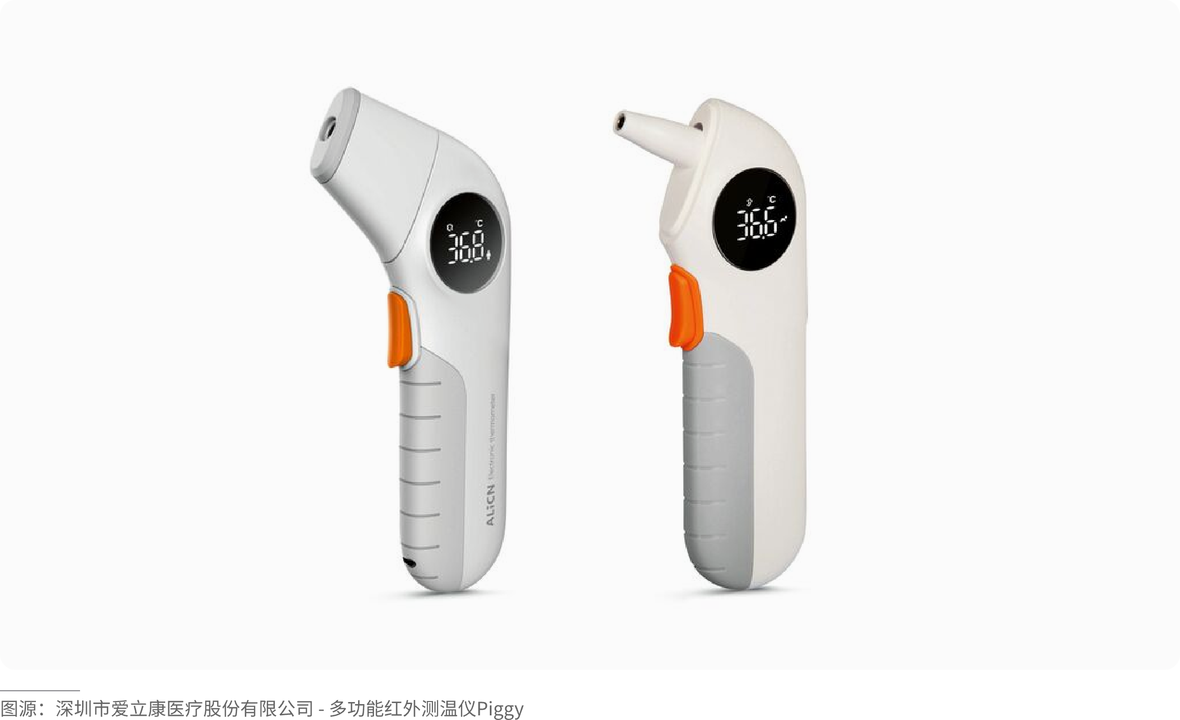
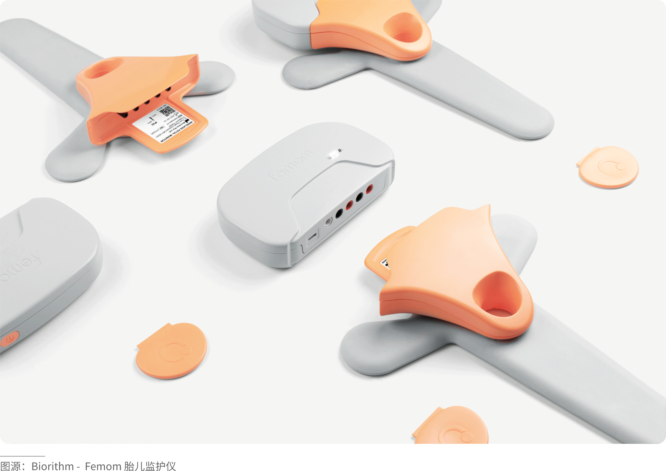
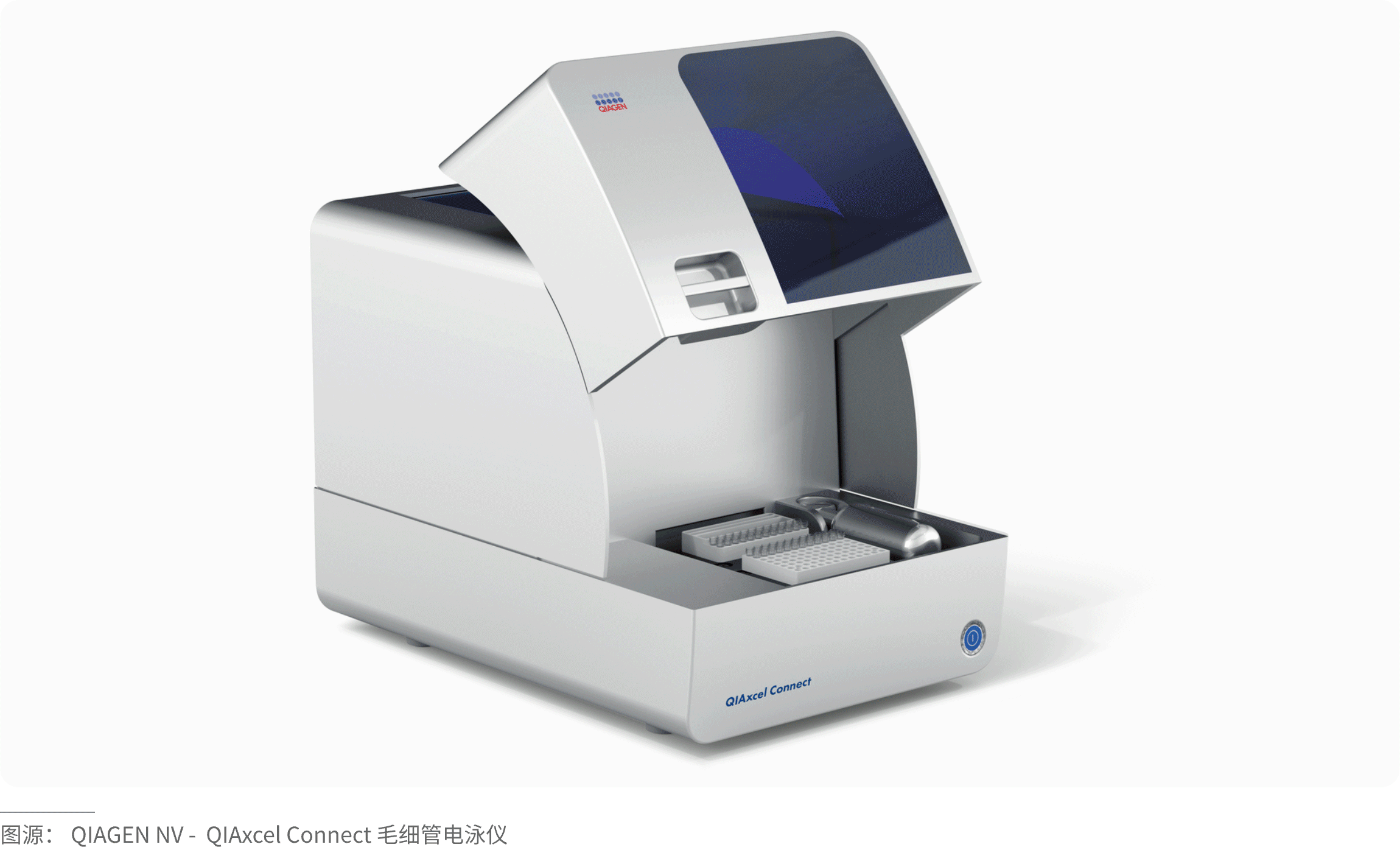
1.Area proportion: Extremely small (typically accounting for 5%–10% of the product's total color area), which is the foundation for achieving the "finishing touch" effect.
2.Visual characteristics: Distinct hue, usually high saturation, and strong contrast in brightness, aiming to create a striking visual focal point.
3.Layout position: Positioned with clear design intent, located on key functional parts such as switches, buttons, knobs, or on the product's brand logo.
4.Distribution form: Highly flexible, can appear in various forms such as dots, lines, surfaces, or overlapping transparencies, to accommodate different product shapes and functional requirements.
(Tips for Selecting Accent Colors)
Compared to the main color scheme of a product, accent colors generally play a supporting or guiding role, occupying a relatively small proportion of the total color area. Most often, they appear in contrast or pop‑color designs—such as adding vibrant colors on top of a black, white, or gray base—a common technique that creates a refreshing and eye‑catching effect.
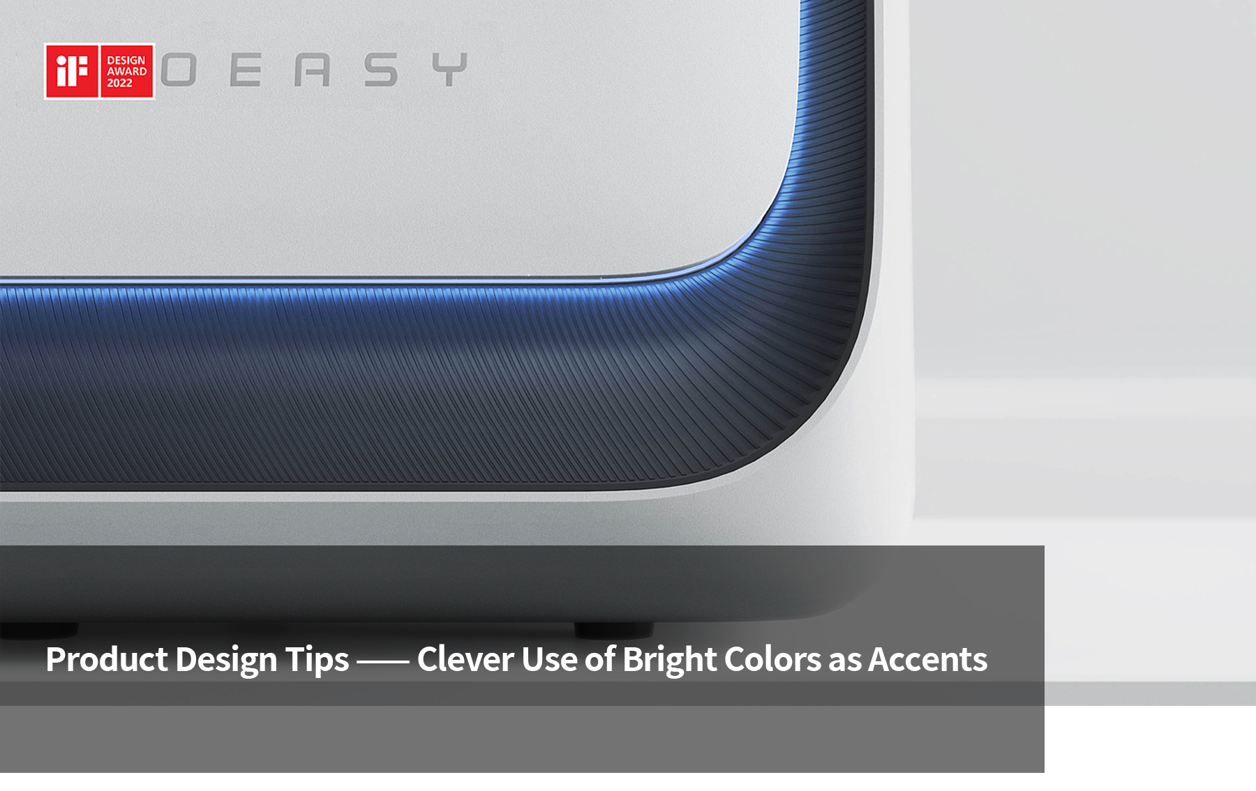
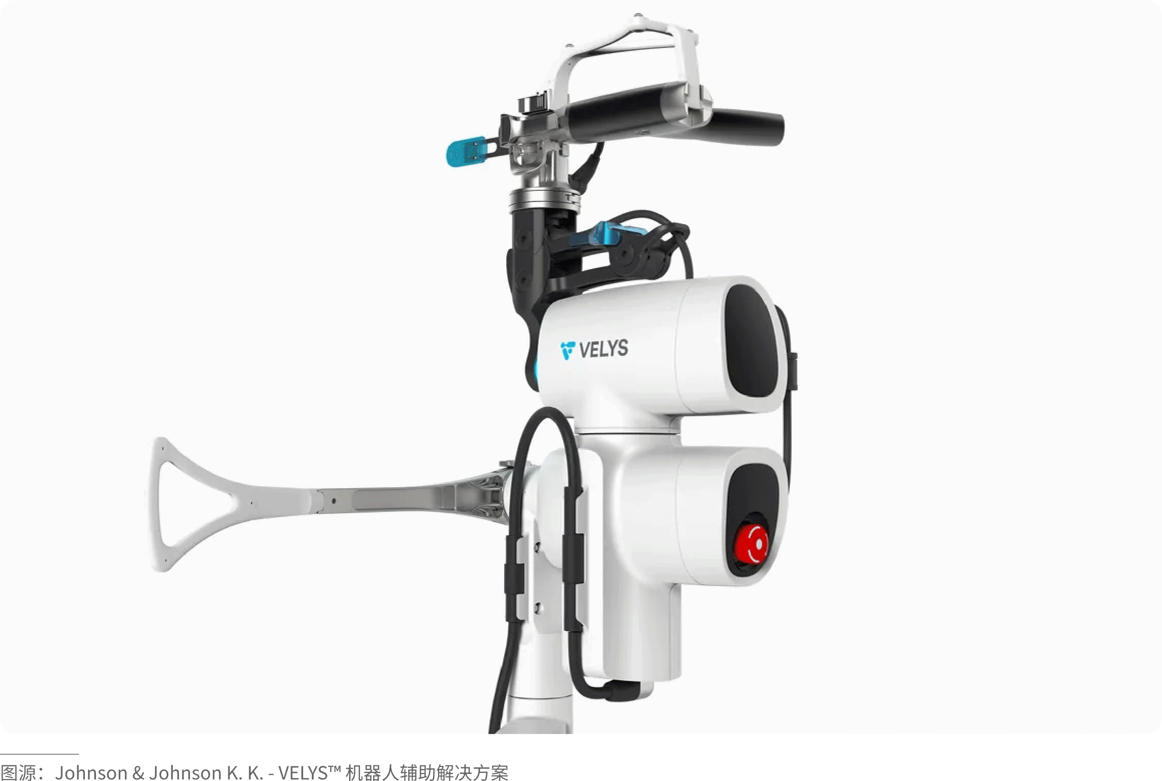
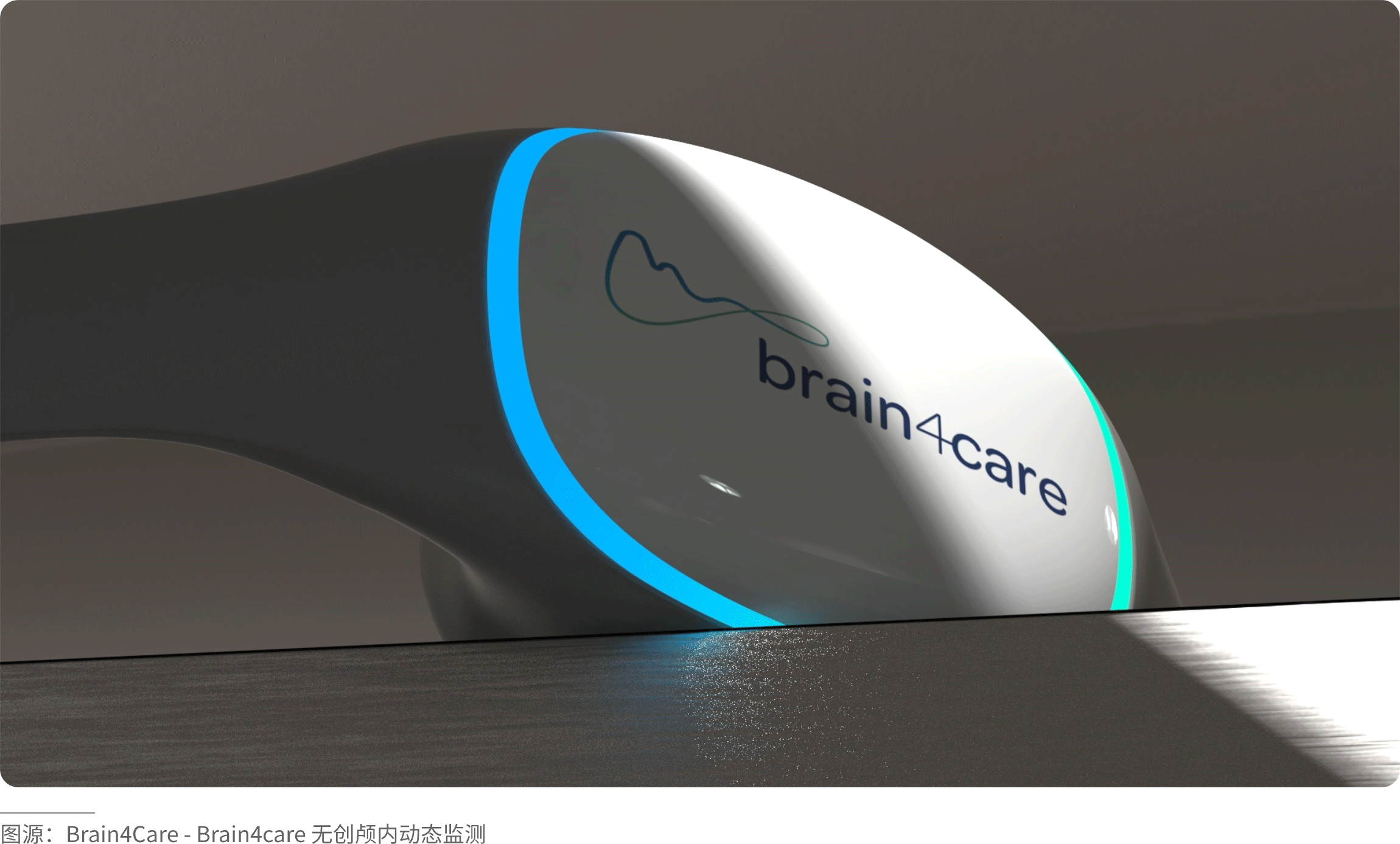
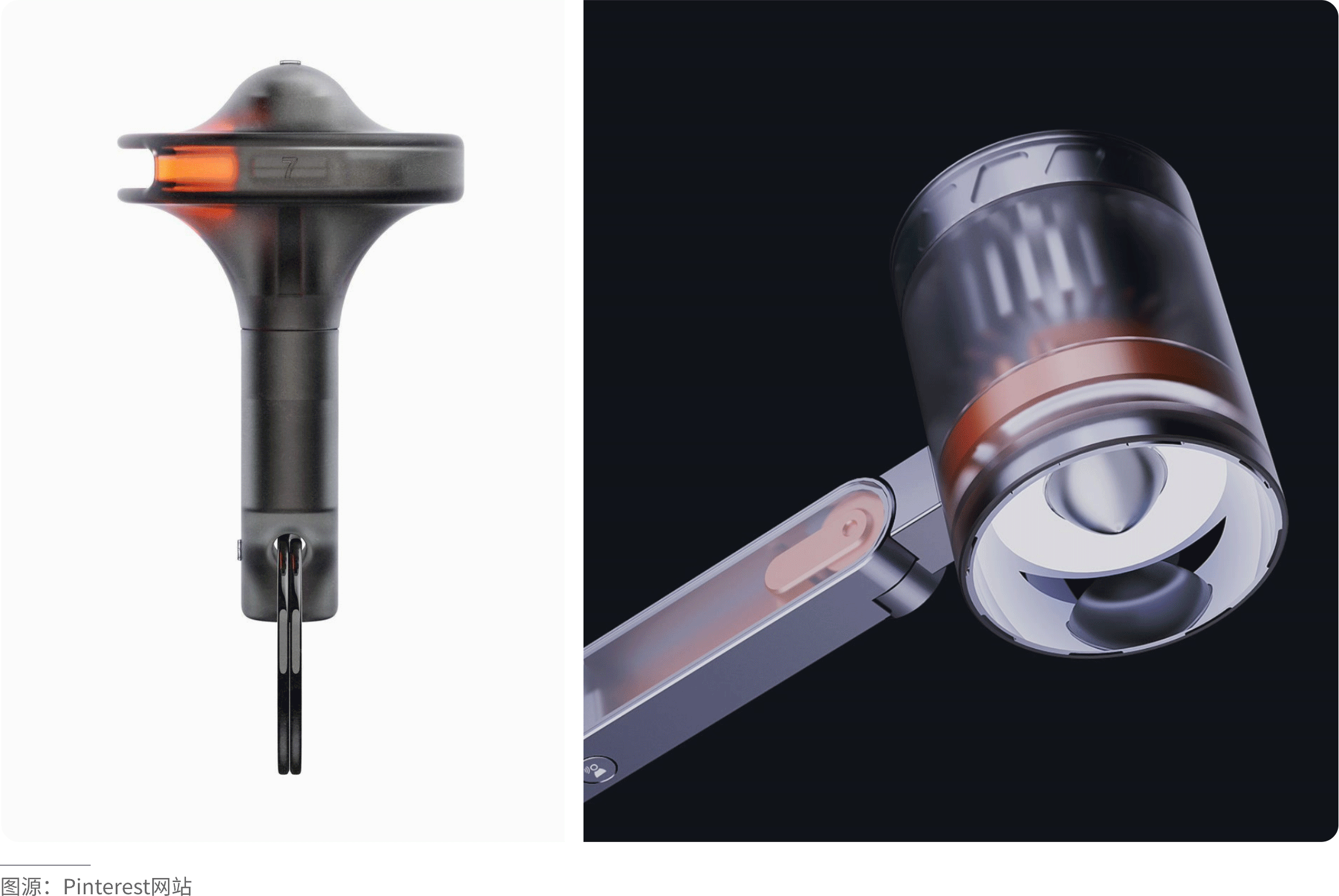
Within the silent, restrained black‑white‑gray tone of the entire product, that touch of high‑saturation orange or fluorescent green serves as the most impactful “visual punctuation” in industrial design. This is not only a tribute to Braun’s classic functionalist aesthetics but also an advanced strategy for building visual hierarchy in modern precision technology. This extremely restrained use of color is essentially a form of “functional navigation.” Visually, it does not disrupt the overall minimalist order; instead, through strong contrast, it establishes an absolute focal point for interaction. With an undeniable presence, it intuitively guides users to identify the most critical operation buttons or interfaces.
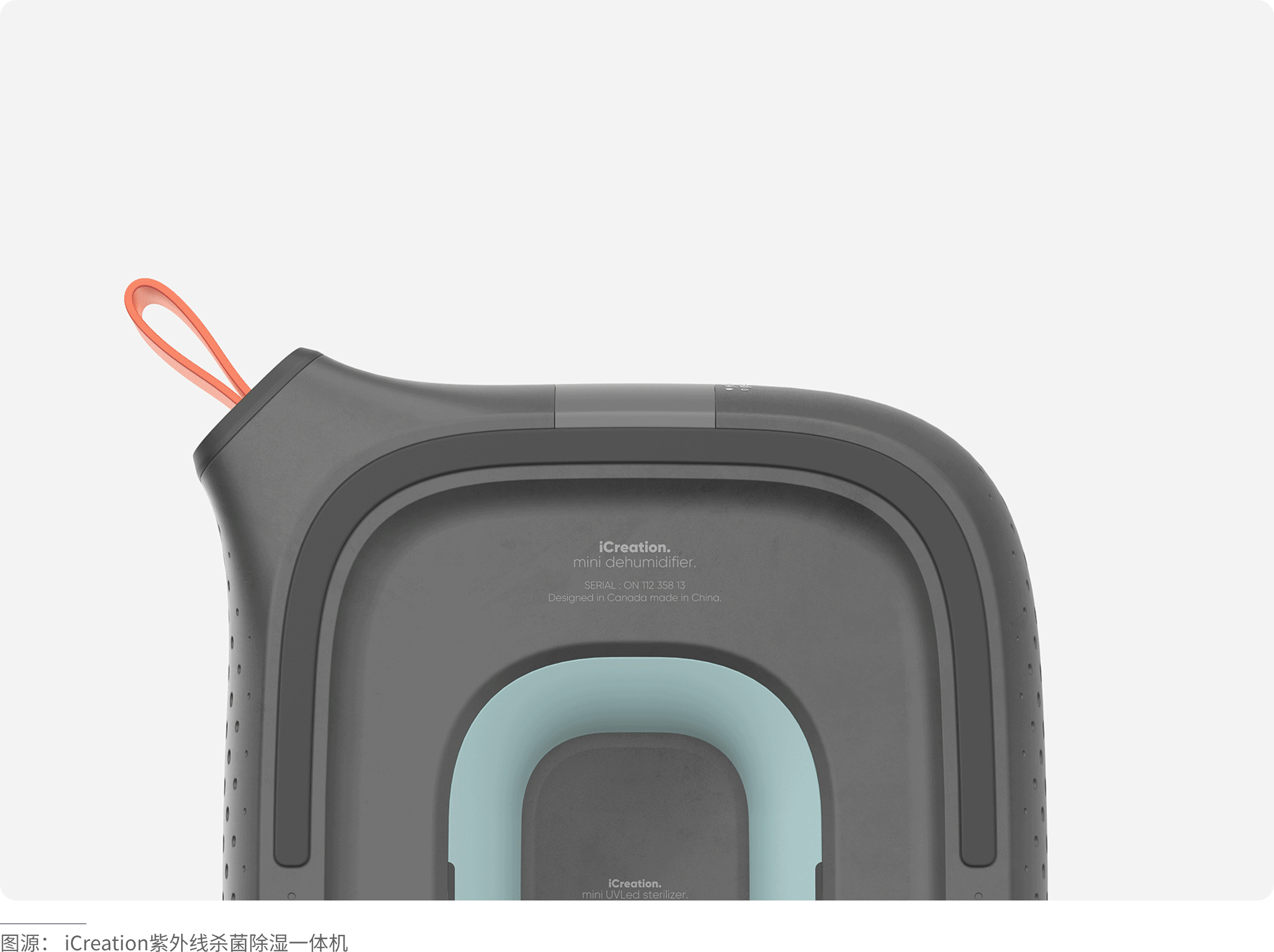
For dark base colors (black, dark gray, navy),
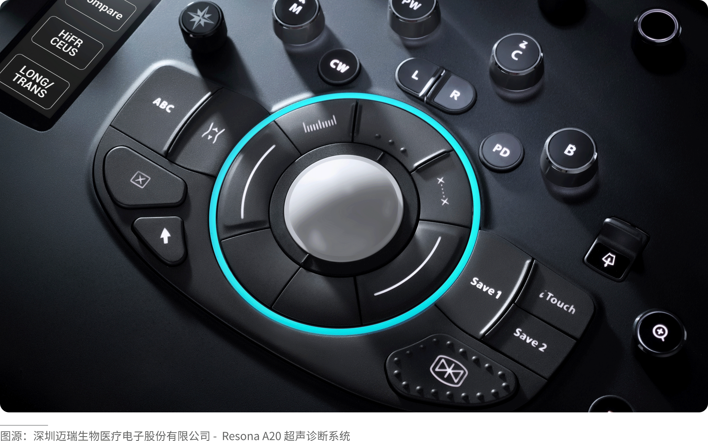
choose high-brightness, high-saturation colors, such as fluorescent green, bright orange, bright red, and magenta. Like neon lights in the night, they create a strong contrast of light and dark, highlighting a sense of technology and power.
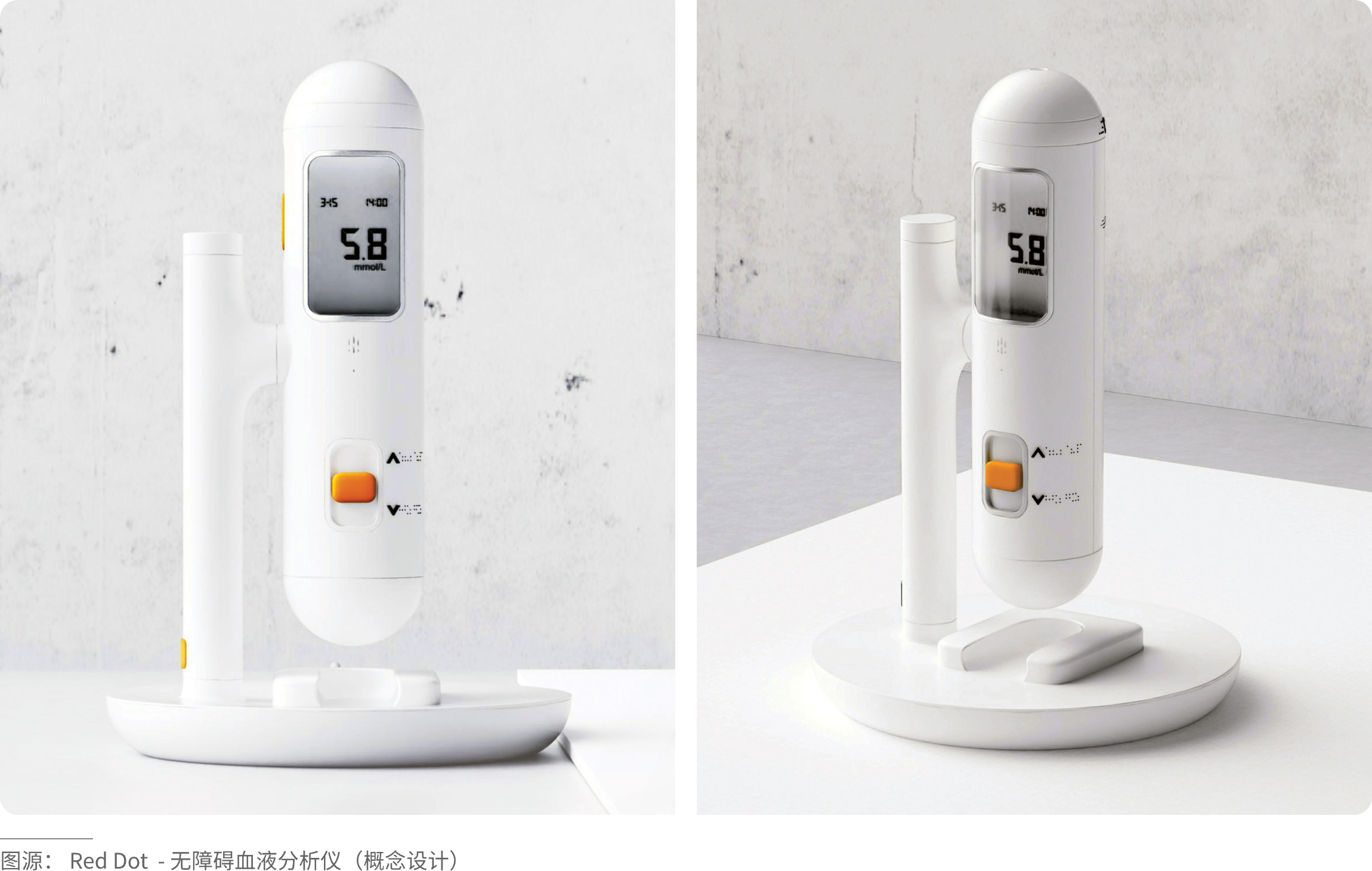
For light base colors (white, off-white, light gray),
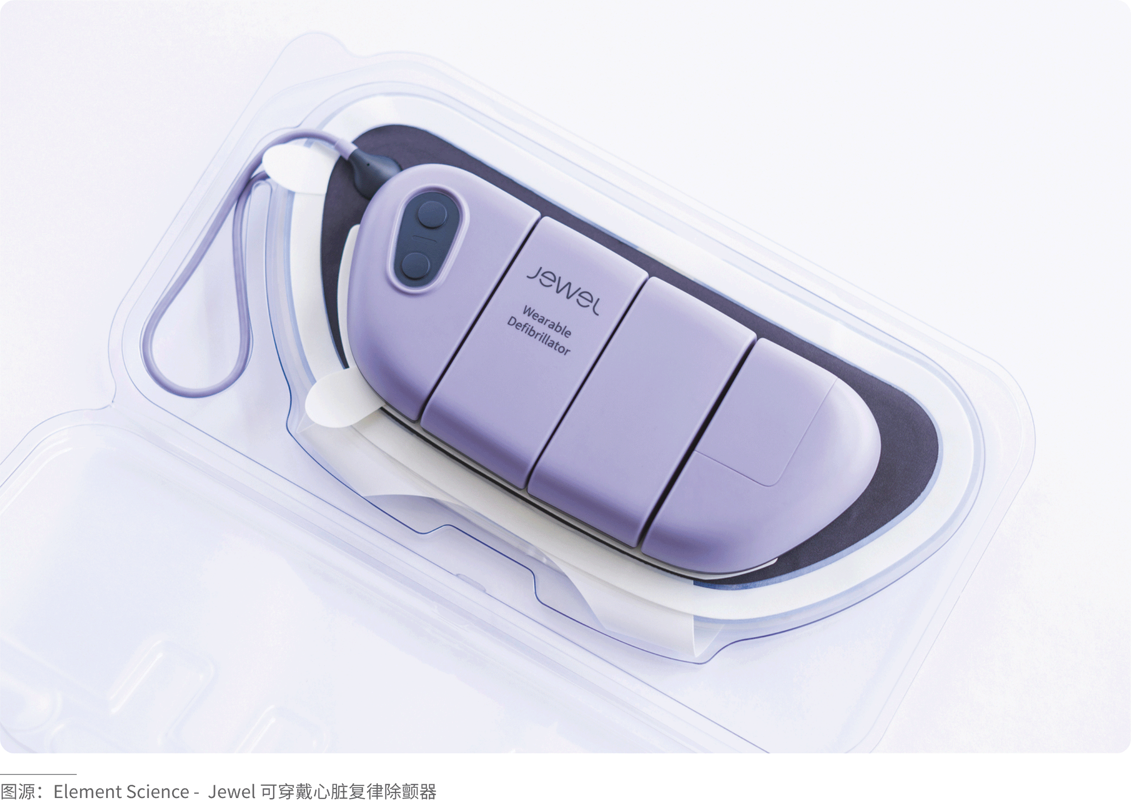
you can choose warm and bright colors (yellow, orange) to create a sense of friendliness, or deep and pure colors (dark blue, dark green) to form an elegant contrast. Like colored dots on white paper, clean and fresh, the accent colors will stand out very prominently.
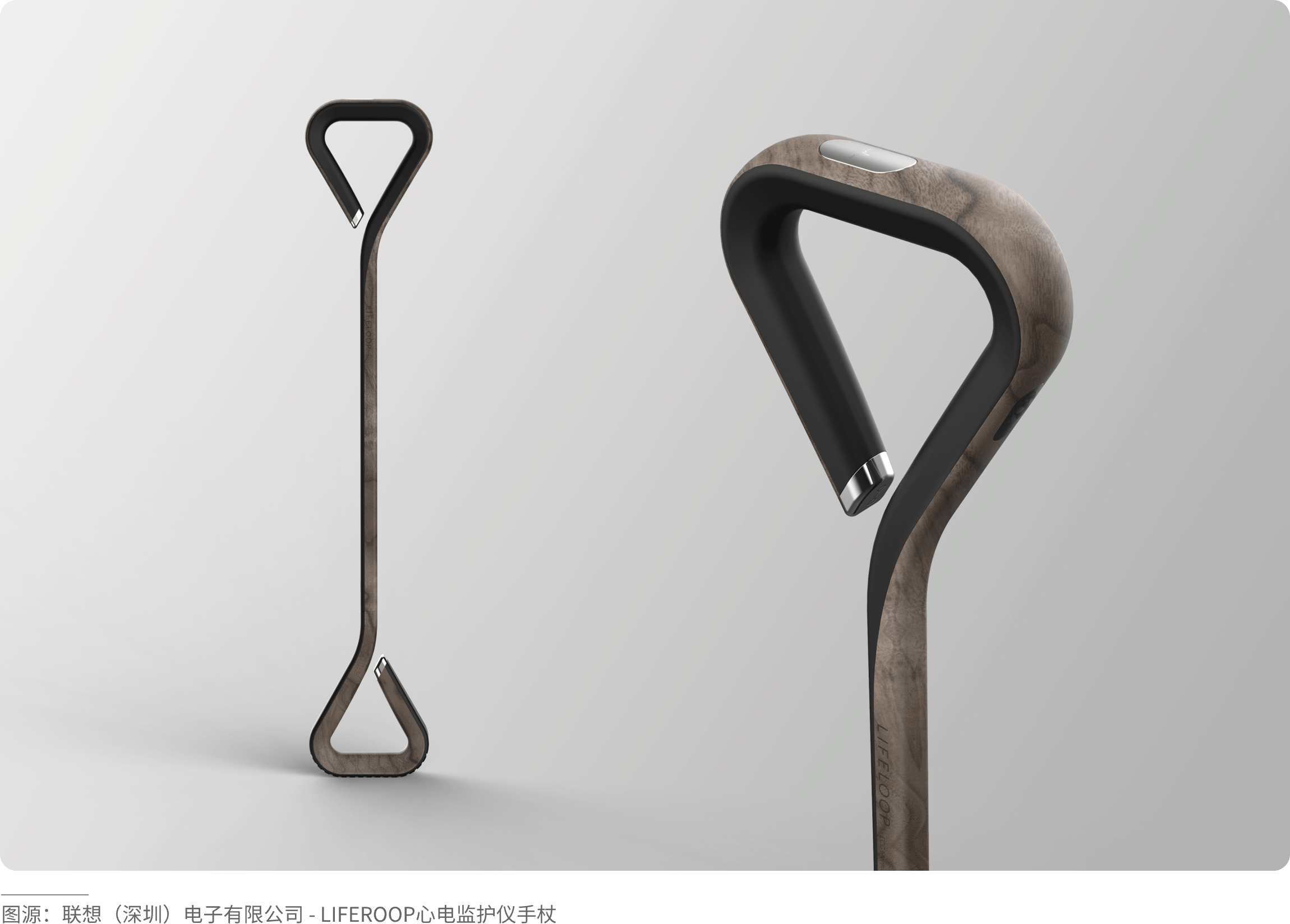
For natural/matte base tones (wood grain, cement gray, slate),
choose colors with high purity and gloss (such as anodized bright red aluminum parts, polished gold). Use “artificial colors” to accentuate “natural colors,” and “glossy” to accentuate “matte,” creating rich layers of texture and color.
For a colored base tone (the product itself is blue or red),
use its complementary color or black, white, or gray. For example, an orange button on a blue body, or a gray decorative strip on a red body. Use a small area of strong contrast or neutral colors to balance, avoiding overly intense color conflict.
· Bright color + black
A touch of bright color can instantly "bring to life" a dull, dark product, adding a hint of trendiness and personality to its coolness.
· Bright color + gray
Gray products often give people a sense of simplicity, calmness, and stability. Adding a bright color quickly catches the user’s eye and instantly brightens up the product.
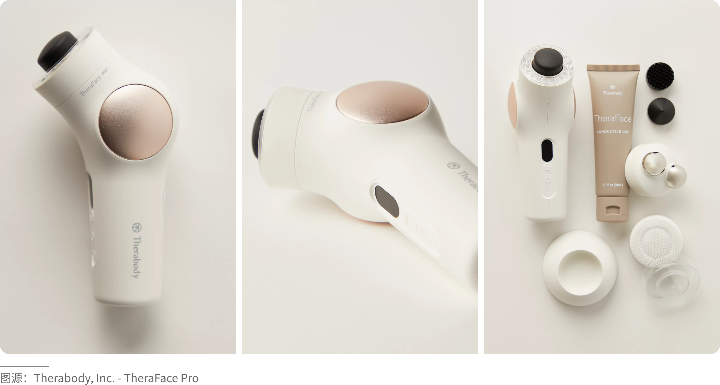
· Bright color + white
It coordinates well with any color. It mostly brings a simple, clean texture. Adding a bright color can add a touch of vitality to the product.
(Methods for Distributing Accent Colors)
If choosing the right accent color is like "selecting the right material," then a scientific distribution method is like "using it in the right place." The distribution of accent colors does not need to be uniform; the core principle is "focusing on key points while maintaining balance." By combining the product's structure, function, and visual focal points, accent colors should be applied where they have the greatest impact, achieving the effect of "one accent brightens the whole product."
· Point Distribution
Focus on interaction and reinforce functionality. Point distribution is the most common and risk-free method of placing accent colors in product design. It involves applying accent colors as "dots" on the product's core interaction areas and visual focal points, such as buttons, knobs, logos, charging ports, and function indicators. This not only guides user operations but also precisely creates visual memory points. A single dot needs to be sufficiently focused; multiple dots can create rhythm (e.g., a pop of color within a grid of cooling holes).
· Line Distribution
Outlining contours and enhancing layering. Line distribution applies accent colors in the form of “lines” along product contours, parting lines, seams, and similar locations. It is used to outline the product’s form, distinguish functional areas, conceal manufacturing traces, and improve the product’s sense of line and refinement.
Lines can also create complex gradients, sparse‑dense effects, and虚实 (transparency/void‑solid) effects, giving the overall product a more dreamy or speed‑oriented character. It is crucial to follow a logical arrangement, maintaining rhythm while preserving the product’s overall unity. Lines can also form graphics, enhancing the product’s design aesthetics.
The thickness of a line affects its visual weight and perceived strength. Thick lines attract more visual attention and convey a sense of power; thin lines feel softer and more delicate. Using lines of appropriate thickness on different parts of the product can deliver distinct psychological cues.
· Surface Distribution
Local highlighting and visual balancing. Surface distribution applies accent colors in the form of “small-area surfaces” on localized functional or decorative areas of the product. The area typically does not exceed 10% of the product’s total surface area. It is used to locally brighten and balance the visual composition, preventing the overall product from being too monotonous. This distribution method is suitable for products with a single dominant color and a regular form.
Compared to points and lines, surfaces occupy a larger area in space and thus have a stronger visual impact. Different shapes, sizes, spatial positions, and other factors of the surface can evoke different visual perceptions. The most important role of surface distribution is to differentiate panels or functional zones.
· Translucent Overlay Distribution
Merging materials to highlight texture. Translucent overlay distribution is a mainstream accent method in high-end products today. It combines special materials such as transparent, frosted, or semi-transparent finishes, placing the accent color on the inner or bottom layer of the material. This creates a visual effect that is “revealing yet concealing, soft and premium,” avoiding abruptness while achieving a deep integration of color and material. Different levels of transparency (1–100) produce different visual effects. Low transparency enhances the hazy feel and softens the clutter of internal complex parts, while high transparency relies more on the aesthetic appeal of the internal structure.
(Conclusion)
Accent colors embody the “less is more” principle in industrial design, balancing functionality, aesthetics, and brand identity to achieve maximum value with minimal color. As a professional industrial design company, WYYL Design consistently adheres to the “less is more” design philosophy, regarding accent colors as a core detail that enhances product quality and shapes brand personality—they need not be complicated, yet they break monotony; they need not be flashy, yet they convey taste; they need not be piled on, yet they illuminate details.
Please follow and like us. See you next time!